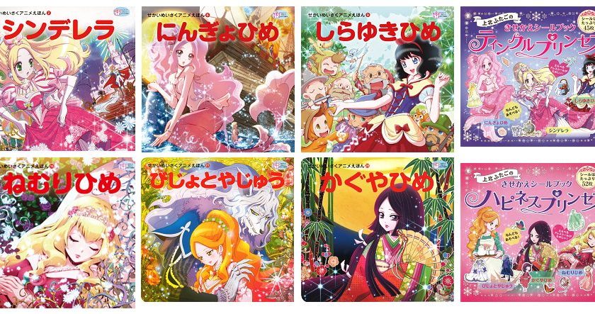
Now, most of us spent our childhood reading classic fairy tales such as Cinderella, Snow White etc., and chances are we’ve grown fond of, or at least used to, the depiction of the characters from the renowned Disney adaptations. I mean, even the famous JRPG series Kingdom Hearts by Square-Enix uses them too.

Nevertheless, we all know that despite the strong association with Disney, the latter didn’t create those centuries-old fairy tales. This means that other publishers of these stories have to commission original illustrations, just like what Japanese publisher Kawade Shobo Shinsha has done. Except that parents have been up in arms over their choice of aesthetics, which they claim is too moe (meaning too cutesy in an anime-sense, but with slightly negative connotations) and inappropriate for the target audience of kids. Take a look for yourself.
絵本萌え絵論争が囂しいですが、弊社の「せかいめいさくアニメえほん」は作家さんたちに「萌え絵を描いてください」とお願いしたものではなく「子ども自身が飛びつく絵を」という発注のため「なぜ萌え絵にしたのか」としきりと質問され困惑、担当者も何度説明しても理解してもらえず苦慮しています。 pic.twitter.com/KqhLzAj2vJ
— 河出書房新社 (@Kawade_shobo) November 8, 2018
In the tweet above, Kawade Shobo Shinsha defends its choice of illustrations, stating that it isn’t trying to deliberately advocate for moe aesthetics to children, but rather the illustrators were told to use designs that would appeal to kids in the modern age and encourage them to read these classic tales, and subsequently learn to love reading as a whole. Simply put, an anime art style just so happened to be the one used for these series of fairy tales.
All that being said, if a contemporary art style can get kids excited about reading these classics and help spark a broader interest in reading and language, there’s very much to be praised about Kawade Shobo Shinsha’s strategy rather than condemned. What do you think?
